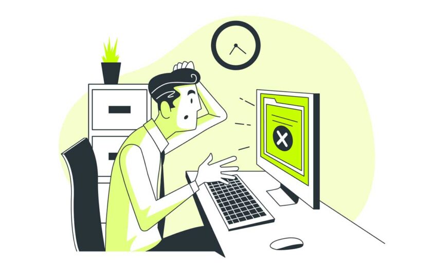
🎯 Introduction: Why Graphic Design is a Make-or-Break Factor for Your Brand
In today’s fast-paced digital world, your brand’s first impression often happens before a customer even reads a single word. Your visuals speak louder than your messaging — and bad design can sabotage your success. Whether you’re a small business, a startup, or an established company, poor graphic design can make you look unprofessional and drive potential customers away.
In this blog, we’ll dive deep into the most common graphic design mistakes that are secretly killing your brand’s credibility — and more importantly, how to fix them.
🚫 Mistake 1: Poor Color Choices
Color isn’t just about aesthetics — it’s psychology. Studies show that 93% of consumers base purchase decisions on visual appearance, and 85% say color is a primary reason.
What goes wrong:
- Using too many colors, creating visual chaos.
- Choosing colors that clash or don’t align with your brand personality.
- Ignoring color psychology — for example, using red (associated with urgency) in a calming wellness brand.
✅ How to fix it:
- Stick to a 3-color palette: a primary brand color, a secondary color, and an accent.
- Research color psychology: blue builds trust (great for finance), green represents health and growth, while black signifies luxury.
- Use tools like Coolors or Adobe Color to find complementary shades.
📌 Pro Tip: Alizatouch specializes in crafting unique brand palettes tailored to your audience’s emotional triggers.
🚫 Mistake 2: Inconsistent Branding
Imagine scrolling through a brand’s Instagram page where every post looks completely different — you’d assume it’s unprofessional, right? That’s the power of consistency.
What goes wrong:
- Using different logos, fonts, and styles across platforms.
- Uncoordinated social media posts and website design.
- Changing brand tone in visuals (e.g., serious website, playful Instagram).
✅ How to fix it:
- Create a brand style guide (logo placement, font types, color codes, image style).
- Keep the same tone, whether it’s minimalistic, bold, or playful.
- Use design templates for social media and marketing materials.
🔍 Case Study: One of Alizatouch’s clients revamped their Amazon store with a consistent product listing design — resulting in a 35% boost in sales.
🚫 Mistake 3: Overcrowded Design
“Less is more” isn’t just a phrase — it’s a golden rule of design. Cluttered designs overwhelm customers and dilute the core message.
What goes wrong:
- Too many text blocks, icons, or images in one design.
- Overuse of bold fonts, shadows, or color effects.
- Lack of whitespace (negative space) making the design hard to follow.
✅ How to fix it:
- Focus on one primary message per design.
- Prioritize visual hierarchy: headline > key benefits > call to action.
- Leave breathing room — whitespace helps the eye flow naturally.
🎯 Did you know? Brands like Apple master minimalism because it simplifies decision-making for customers.
🚫 Mistake 4: Relying on Free Stock Images
Stock images are everywhere — but overused ones make your brand feel generic. A study by Venngage found that custom visuals are 40% more effective than stock photos.
What goes wrong:
- Customers recognize and ignore common stock photos.
- Generic visuals fail to tell your unique story.
- Poor quality or unrelated images harm credibility.
✅ How to fix it:
- Invest in custom graphics or product photography.
- Use high-quality, niche-specific image libraries (e.g., Unsplash, Pexels for lifestyle shots).
- Personalize stock images by adding branded elements or filters.
🔍 Alizatouch Advantage: We create bespoke product visuals designed to boost conversions.
🚫 Mistake 5: Ignoring Mobile-Friendly Design
Over 60% of website traffic now comes from mobile devices — yet many businesses still prioritize desktop design.
What goes wrong:
- Designs look amazing on desktop but break on mobile.
- Text becomes unreadable, images misalign.
- Slow loading times from unoptimized graphics.
✅ How to fix it:
- Design mobile-first or test desktop versions for mobile responsiveness.
- Use SVG images — they’re scalable without losing quality.
- Compress images for faster load times (tools like TinyPNG).
🔍 Quick Win: Google’s Mobile-Friendly Test can show if your site design is mobile-optimized.


💡 Conclusion: Elevate Your Brand with Alizatouch
Graphic design isn’t just about looking good — it’s about communicating trust, value, and professionalism. By fixing these 5 mistakes, you’ll instantly position your brand above competitors.
👉 Ready to create designs that convert? Let Alizatouch craft custom visuals that drive more sales, engagement, and trust.
✨ Contact us today for a free consultation!
March 22, 2025
Mastering Meta Marketing for Your Business: The Ultimate...
March 22, 2025


